neighby Interview
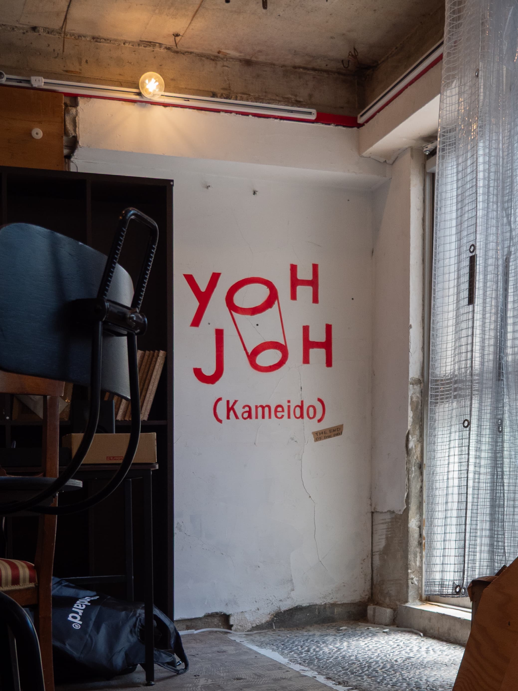
FIG.1
—First, I’d like to hear about the general outline of YOHJOH’s creative process!
Mochizuki: Normally, when creating a visual identity (VI), the standard approach is to establish usage restrictions to ensure it looks the same no matter when or where it’s used. In this case, however, the concept from the very beginning was to ensure that the identity wouldn’t be lost even if it were used without such rules.
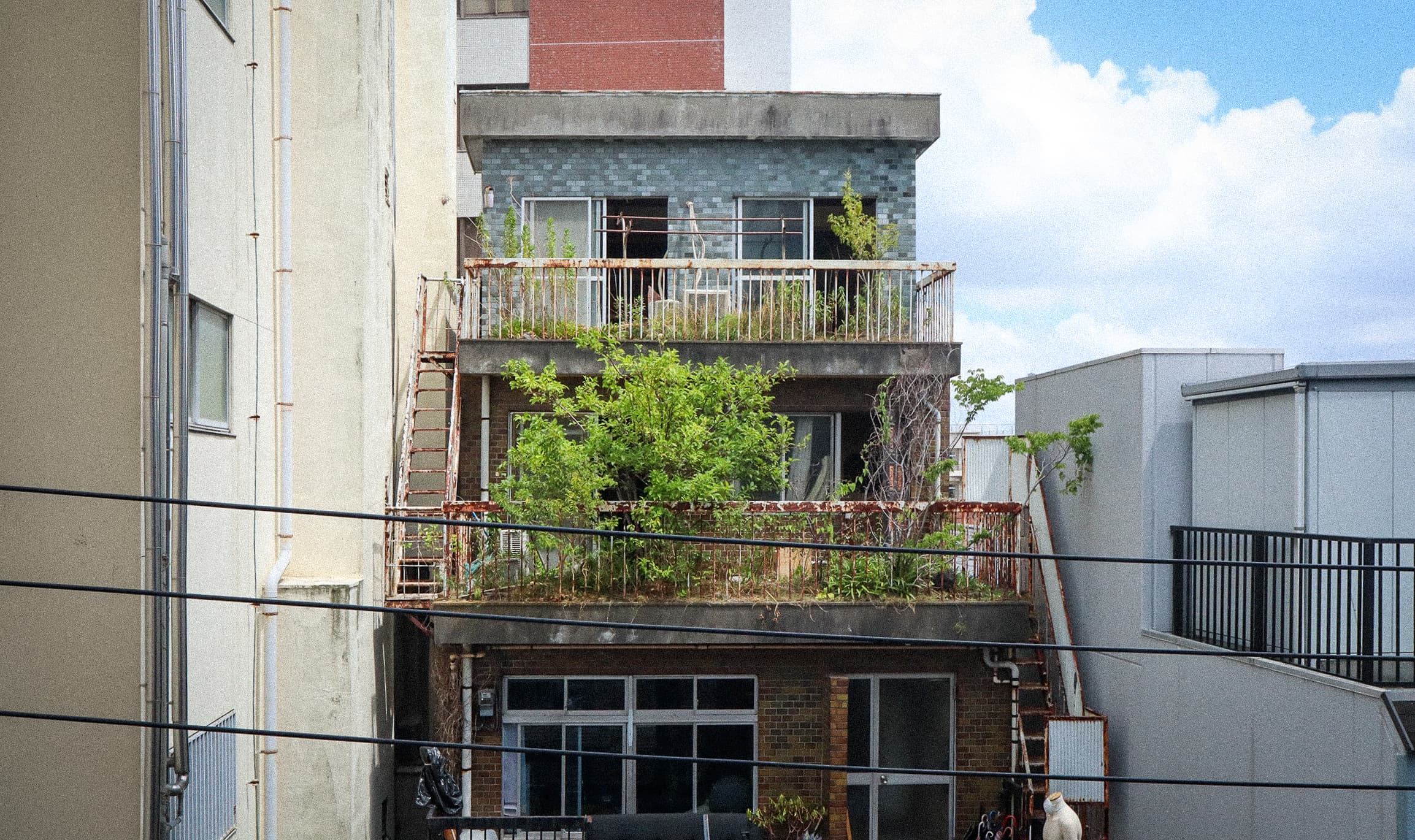
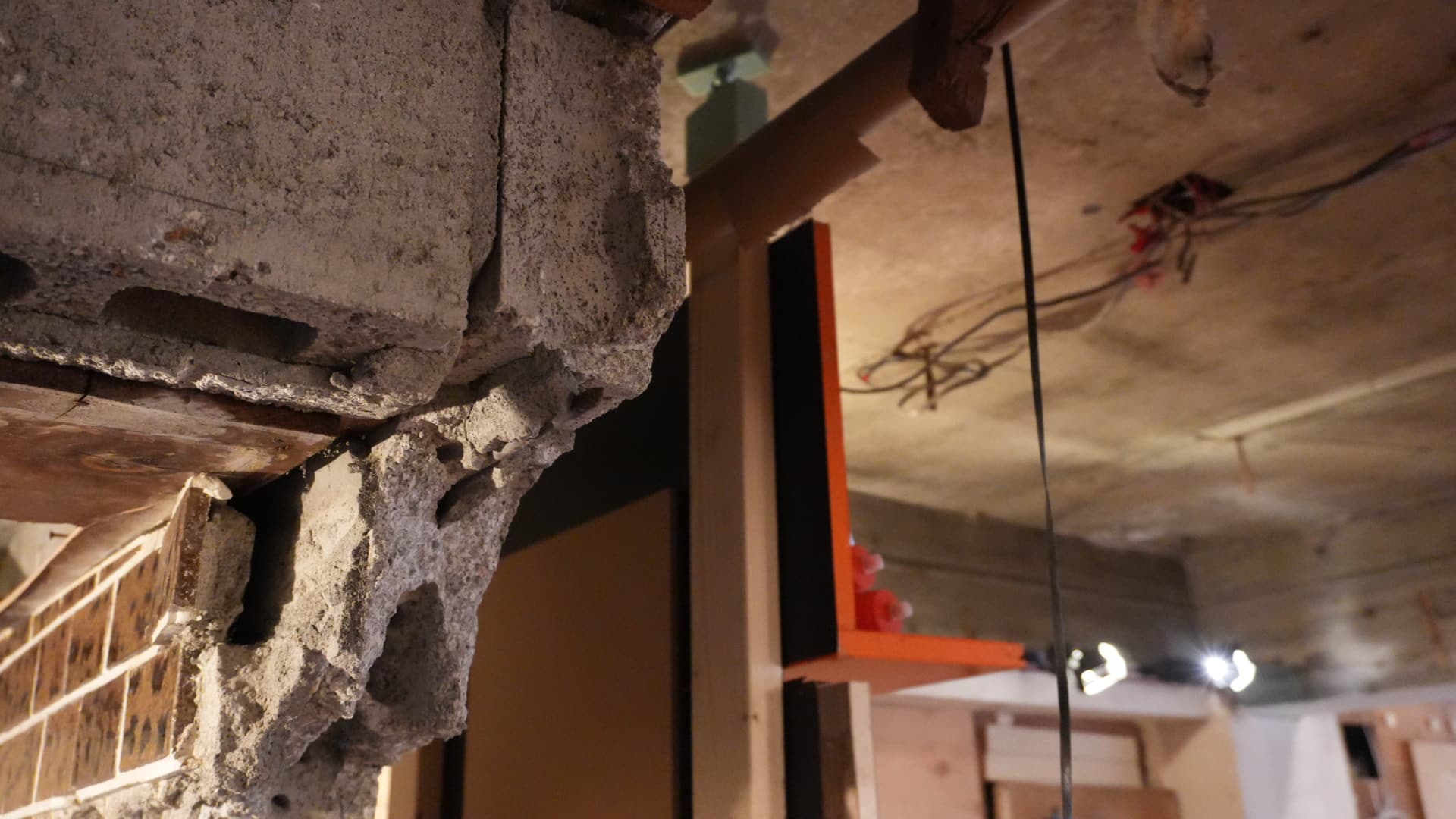
The building in Tsuchiya-Kameido itself involves working with plumbing and electrical systems—things you normally wouldn’t be allowed to touch. It’s the same with fonts: while it’s not something you’d normally think of—creating your own and making them usable—we thought it would be great to have the flexibility to make that happen.
Mochizuki: I’d also heard that YOHJOH was a single large project containing many “eggs” of smaller projects. Since it’s a place for nurturing creators, I wanted to reflect the appeal of being able to create and then dismantle things, so I envisioned an editable font. Since YOHJOH is DIY, I thought it would be great if the design could be DIY as well.
—So, initially, there was a request to create a logo, but a font wasn’t a must-have.
Mochizuki: That’s right. However, as a “design partner” helping to shape YOHJOH’s branding, I started by asking why architecture needs a logo in the first place.To put it simply, there’s no inherent connection between the building itself and what takes place inside it. For example, with a church or a produce stand, the purpose of the architecture and the inherent necessity of the architecture itself align at a glance—in a sense, the building itself is the medium, so a logo isn’t necessary. On the other hand, it’s common to see the sign on a blank white building—which could be anything—swapped out from a convenience store to a dentist’s office.
— This reminded me of a project called “TOKYO NUDE” , which explores what would happen to Tokyo if logos, advertisements—in other words, all graphic design—were completely stripped away. When a city is laid bare like that, its meaning truly vanishes, and it even becomes eerie.
Mochizuki: The eeriness of a liminal space where something that should be there is missing. YOHJOH isn’t one of those “anything-goes” urban buildings; it has its own distinct identity. So, when I realized that the image of a logo—one tied to this specific location—radiating outward from the building was important, I asked, “Do these perfectly organized letters share the same essence as this building?” The answer was no.That’s where it all began. This is a discussion that applies not only to architecture but to graphic design as a whole. In the produce section of a supermarket, the vegetables themselves serve as the medium conveying the message—like “This tomato is red and looks delicious”—so a logo isn’t necessary, but the instant noodle aisle is overflowing with graphic design. Fundamentally, graphic design is needed to re-impart meaning to objects that have been severed from their context.
—With that in mind, how did you design the YOHJOH font to be used?
Mochizuki: To begin with, if you look closely at the YOHJOH font, it’s a little off. The center lines aren’t aligned. Normally, logos have a grid drawn on them, which makes them reproducible.In the case of YOHJOH, the master data itself places elements in positions that lack any inherent necessity, so even if someone else were to take just a portion of it, they couldn’t recreate the exact same composition. The fact that the master data is unconventional from the start means that, for example, even if it isn’t perfectly aligned when stenciled onto a wall, it doesn’t violate YOHJOH’s rules. The “(Kameido)” beneath “YOHJOH” is deliberately shifted to the right, which is precisely why you might try to make it look centered in your own way. That kind of physicality—existing outside the system—remains. Just like a liminal space, with a “proper” logo, the moment something that “should be there” is misaligned, it creates an “unnerving” impression.The stencil at the entrance to (YOHJOH) is intentionally offset to begin with, and since it’s designed to accommodate other kinds of misalignment as well, it doesn’t feel unsettling. That’s why, when considering expanding the number of locations bearing the YOHJOH name, even if they change little by little, the essence of YOHJOH should remain.I think that’s the provisional nature of this design—and perhaps its formal strength. Above all, it leaves room for those using the logo to have fun with it. Design software comes equipped with a button that centers everything with a single click; there’s no provisional nature there.
— The moment the rule of “placing it in the center” disappears, a sense of provisionality arises—in the sense that “it just happens to be in that position right now.” Or rather, provisionality is embedded in the graphic design itself. I don’t think that’s all that uncommon.
Mochizuki: Ultimately, I think it comes down to relationships and capital.In a transaction based on cost and benefit, if graphic design becomes “provisional,” it results in an unfavorable contract and isn’t welcomed. Clearly, something straightforward and highly versatile is more convenient, isn’t it? If you ask why this kind of “provisional” design emerged this time, I think it’s simply because the relationship between ASIBA and neighby wasn’t one of straightforward cost-benefit calculations.Even if the deliverable might be a loss in terms of practicality as a logo, I feel we ultimately arrive at the conclusion that this “temporary” design came about because we mutually agreed that the resulting design’s intrigue and quirkiness constitute the essential deliverable.But in the sense that we’re being paid to create designs that surprise people, while this goes beyond a simple cost-benefit analysis, there’s still a clear economic relationship at play.
Credit
Related Works

Price Tags, PVC Pipes, and Hyperobjects
Semi-Open Editorial Meeting: 'The Provisional and Residents' (二瓶雄太)
ESSAY
2026.07.01.